We've told you about the enormous changes the historic period we're going through has brought to the world of retail: a technological leap that has pushed e-commerce sites to adapt quickly to digital transformation and not let their customers down.

Since the start of the year, two million new consumers have been recorded in Italy alone, and the sector will grow up to 55% globally in 2020 (source: AGI). Ease and speed are the two keywords that retailers worldwide have had to keep in mind, to cope with this amount of unexpected traffic and keep the evolution of the technology-driven experience consistent.
Our community of testers could not contain their curiosity in the face of these numbers and this technological evolution, and once again wanted to know more:
How many clicks does it take to buy a dress online?
A research project that starts with data from simple analysis, but represents the first numerical indicator of much broader thinking: "quick and easy" as an essential strategy for the digital customer experience of their consumers.
Research: how many clicks does it take to buy a dress?
In the week of 10-16 August, together with our community of testers, we simulated buying a dress from some of the most famous e-commerce sites in Italy, counting the number of clicks needed to achieve the goal.
Before we reveal the results, some clarifications are necessary:
- The mouse clicks were counted from the purchase button (once the product colour and size had been selected) up to the last button to confirm the order
- For each purchase, credit card was selected as the payment method
- For all the e-commerce sites, the purchases were simulated without registering (therefore by proceeding "as a guest")
- We counted all the mouse clicks required to complete the details, buttons and check marks
- Shortcuts like "sign up via social media" or similar were never used
- The research focuses on the number of clicks needed to confirm a purchase order; it does not take into consideration the time taken to reach the goal
So here's how it went:
.webp?width=680&height=510&name=AppQuality_Benchmark%20Click%20Ecommerce%202020-08%20(2).webp)
The results present a rather positive and coherent view of the Italian situation: the difference across 13 e-commerce sites is only about ten clicks (the situation we found for opening an online current account was quite different).
However, there is still room for improvement. The goal is clear: to minimise the number of clicks that lead to conversion.
Making a purchase is like committing to a relationship. It's supposed to be as simple and easy as one click; however, there is always hesitation. Let's face it, your customers don't want to jump through hoops to make a commitment and confirm their purchases. The simpler the buying process, the better.
According to Jeffrey Zeldman's "three-click rule", companies need to understand how people use the web and, in this case, the importance of the checkout page. By knowing this "rule", we can understand how to create landing pages that appeal to customers and are easy to use. So "less is more", including in this scenario.
When a customer enters your website, the suggested number of clicks needed to navigate and search for information is no more than three. This is based on the belief that customers will get frustrated and often leave if they can't find the information they need within three clicks. This is one of a few reasons why optimising the landing and checkout pages is important in website optimisation.
The number of clicks it takes someone to buy a product on the checkout page is therefore a key factor that should not be underestimated. If it takes more than a few clicks to access the shopping cart or the "purchase confirmation" page, the customer abandons the process.
Payment methods offered
The "Quick and Easy" philosophy can't fail to include payment systems offered at checkout, especially at a time when giants like Amazon let you complete your purchase in just one click.
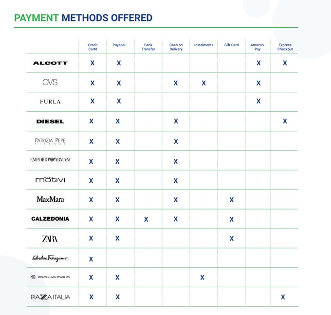
So our testers didn't stop at counting the clicks needed to make the purchase, but also identified the payment methods offered by the various e-commerce sites, also reporting those which have implemented an express checkout system.
Here's how it went:

From the results, it's surprising to see that only 2 out of 13 e-commerce sites have implemented "express checkout" solutions for users who purchase as guests. However, with the exception of Salvatore Ferragamo, they all offer an alternative to credit cards.
Due to the Covid-19 emergency, PiQuadro and OVS made the unusual choice to introduce a deferred payment system that lets their customers pay for their purchase in separate instalments. This demonstrates their strong sympathy for consumer needs.
Alongside these methods there are also UnionPay and Alypay, Chinese-owned payment systems adopted by Patrizia Pepe and Furla respectively.
Conclusions
As with the research "How many clicks does it take to open a current account?", we don't want to select a winner. Each e-commerce site is aimed at target consumers with different needs, who may be more or less digitally savvy.
However, we know that every retailer's goal is to make it as easy as possible for its users to navigate from the home page to buy the product they want: every click in the purchase process is an obstacle to conversion.
That's why we at UNGUESS (formerly AppQuality) are available to help companies identify all possible negative experiences for consumers by asking them directly for precise and detailed feedback that can help construct a "quick and easy" conversion funnel.
