"Can the user reach his goal?" is the key question of usability and it is the one that Lottomatica also asked itself for one of its latest innovative projects.
To try and find this out, the cross-functional team made up of UX, Product and Market Research engaged our team of UNGUESS and Ergoproject. To do this, we asked the only person able to answer: the user himself, or better a group of users guided and listened to by UX researchers while using a service. The sample was selected from within the community of UNGUESS by identifying real users of the service, while Ergoproject made available its UX researchers who took care of studying the characteristics of the users, their behaviours and needs.
The Lottomatica testing project took shape from the combination of the strengths of these two innovative companies, and proved so interesting in terms of both modus operandi and results that we decided to share not only the output but also, and above all, the process step by step, test by test.
For over ten years Ergoproject has been supporting large public and private companies through research, consultancy and training activities on topics concerning human performance and the quality of interaction with digital products/services in terms of user error, functional status, accessibility, usability and user experience.
UNGUESS (formerly known as AppQuality) is the tech-platform to bring collective wisdom in your decision making processes, fast and at any time needed. We rely on three powerhouses: technology (a flexible and easy to use platform with integrated digital solutions); people (our community of real people and the UNGUESS team); methodology (fast, effective and consistent solutions delivered successfully across different industries and geographies).
The practical perspective of the User Research
A usability test can be explained from two opposite but complementary perspectives. The first (theoretical) focuses on how the method works, while the second (practical) focuses on why it should be used and what results can be obtained. The latter is the part we will focus on in order to tell you about the work done with Lottomatica in defining an analysis framework able to guide the decision-making process of the design of their new phygital product for their customers.
The experience seems particularly interesting to us because it shows practically how the data obtained from the evaluation and research with users (User Research) should be an integral part of a design and development process.
It must be kept in mind, in fact, that the activity of User Research, no matter how carefully it is carried out from the methodological point of view, cannot achieve any objective if it is not integrated with normal operations. In our experience, too many reports of usability tests have arrived late or have remained in a drawer because there was no time to read them in depth. It is no coincidence that we have been talking recently about Design Operations (DesignOps) and Research Operations (ResearchOps), which are based on the integration of the management and empowerment of people, processes and tools used for research and product design to bring value to customers and business.
We won't dwell on the theory any longer and will instead return to the story of our practical case study.
The main goal of the test on Lottomatica
The aim was to support Lottomatica in evaluating and improving the design of a completely new and multichannel experience for its customers with a service that involved the simultaneous use of an m-site accessible via smartphone and a totem inside the betting shops.
We imagined a path that, starting from the deepest understanding of the various dynamics of interaction with the service, would support them in iteratively improving the design until reaching an MVP (minimum working product) ready to challenge the market.
Let's see how we did it.
First step: understanding and setting up the strategy
We started by conducting a usability test with 16 users to allow the entire project team to align on the quality of the experience and identify the areas that needed improvement. While the researcher moderated the sessions with the users inside a simulated betting shop, the various project stakeholders followed each individual behaviour and verbalisation from the observation room and, in between the sessions, discussed it among themselves and with the other researchers present (Customer Success Manager, note-taker, strategist)
In order to give more depth to the understanding of the user's experience with this multidimensional interaction between the phone and the to
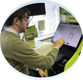
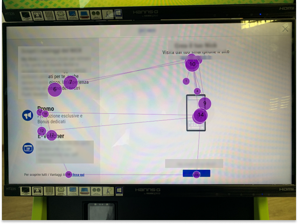
tem, an eye-tracking device was used to record and see in real time what was being observed, for how long and in what sequence.
At the end of each of the three days of testing, a debriefing took place to consolidate and prioritise what had emerged, so that the intervention strategy could be set up in "real time" with the
design and development team even before receiving the report with all the results of the work.
Second step: take action to iteratively improve
Bearing in mind the recent experience of users watching, using and commenting on the service, the project team decided to tackle a second phase of research with the aim of deepening some issues more focused on wording and communication of the experience, which emerged during the first phase. For this second phase it was therefore decided to update the prototype only at the UI level without involving the development team yet, in order to deliver directly to them the final prototype to be developed for the launch.
This gave life to a second usability test, conducted with 19 users, with a partly different goal from the first study. On the one hand, the aim was to check that the changes made were improving (both in terms of metrics and in terms of observed behaviour), but on the other hand it was also intended to support some microsprint designs.
In essence, the study was still carried out with the logic of "live viewing" (stakeholders followed the sessions in real time), the tasks (tasks or use cases) that users were asked to perform were the same, but two variations were introduced that shifted the focus from the lens of "understanding" to that of "improving": the moderation strategy of the sessions changed and the debriefs at the end of the day led directly to small corrective actions (e.g. changing the position and graphic characteristics of a CTA, refining copy and microcopy) that were then verified the following day.
Step 3: Assess the risk and choose the alternative
There is never enough time to solve all the problems of a UI or to satisfy all the needs of a user. There comes a time when you have to move forward and you need to be in a position to assess the risk you are taking in releasing a solution at a certain maturity stage.
In the case of the Lottomatica test, most of the problems had been identified in the first study and resolved during iterations of the second one, but during the sessions a question emerged that remained unanswered: how much would this new funnel impact a pre-existing funnel that was fundamental to Lottomatica? In fact, part of the improvements had been to increase the visibility and comprehensibility of certain CTAs that helped convert new customers, but could have affected the experience of existing customers on other funnels.
The latest study aimed to provide data to assess this impact, and to do this a larger sample of users was required (to increase the ability of the study to detect any differences between different design solutions), while keeping the time to run and share the results to a minimum.
For this reason, an unmoderated remote click-test was conducted with a sample of 50 users who were asked to use two versions (A and B) of the CTA both to understand whether it impacted the funnel of other users and to identify the preferred UI.
The study, launched on a Friday, delivered results on Monday and verified that the interaction with the main funnel was not made more complex by the UI refined during the previous tests.
Let us briefly review the project's stages:
A first usability test with 16 users for alignment on current status with moderator and eye tracking in live viewing.
-
the project team updates the UI based on the test results
-
a second usability test with 19 users in live viewing to check if the changes were improved and to support microsprint design
-
new necessity: measuring the impact of the new funnel on other funnels of Lottomatica
-
unmoderated remote click-test with 50 users to identify the preferred UI.
Test results: what user integration has led to
Figuring out what the customer does is not enough. Although the Lottomatica team had a deep knowledge of their users and a strong expertise in UX, the transition from theory to practice always hides pitfalls.
Being able to verify one's own assumptions about the customer, especially with new interactions such as phygital interactions, has made them more aware of the direction to take in order to improve the product and more confident in presenting, with the data in their possession, the design choices to the business.
In detail, the iterative evaluation of the prototypes with users opened a window on the 'real' that allowed to:
-
Confirming design assumptions: when adding new features or changing user routes, it is difficult to imagine how users will react and what difficulties they may experience.
-
Focusing on areas that were not thought to be problematic: when designing, there is a tendency to focus the effort on 'new' or imagined more complex areas and functions, but when user feedback comes in, problems often emerge where they were not expected. This allows the focus to be shifted to areas that are actually critical to the user and to shelve doubts about areas that generate unnecessary concern.
-
Making decisions based on objective data: during the A/B tests, the most promising solution was quickly identified, but information were also collected about the best design elements and patterns to be used on other projects.
-
Telling the rest of the BU about the choices made: with the qualitative and quantitative results of user evaluations always on the table, no time was wasted debating on assumptions, trying to imagine possible problems or needs of a user: instead, all the time available was invested in finding and implementing solutions that would solve problems and/or seize real opportunities.
Only testers of legal age were involved in all test phases.
Case Study written in collaboration with Simon Mastrangelo, co-founder and CEO of Ergoproject Srl.
