In recent times, consumer expectations of eCommerce sites have not only increased but are evolving towards the personalisation of offers, which should no longer be an infinite scroll (Fortune). Precisely for this reason, a year ago we launched one of our now famous Click Challenges: "How many clicks does it take to buy a dress?" At the end of that research we recalled that, simply put, the goal of any retailer is to make it as easy as possible for its users to purchase a product. "Every click in the purchasing process is an obstacle that separates us from a conversion", we concluded.
Our click challenges have since evolved. We have added other metrics, namely satisfaction, usability, design, information capacity and reliability. With this research we are adding the Net Promoter Score, the Customer Effort Score and a personal shopper rating.
As if there weren't enough new elements for this research already, we worked on two countries: Italy and Spain. Spanish and Italian users rated 10 Italian luxury eCommerce sites and 10 Spanish fast fashion eCommerce sites. The choice is due to the specific features of the two countries: while Spain has always stood out for its innovative retail model (Zara is an example of this), Italy is best known for luxury brands (such as Versace and Valentino).
The click count
In mid-June (until the 17th), the users of our community had a special mission: to count the clicks that separated them from concluding a purchase on each of the websites included in the study.
For the click count we specify that:
- Clicks were counted from the shopping cart page when it contained at least one item.
- To simulate the purchase, users used a card with incorrect data (therefore they did not complete the purchase). The count was continued until the final checkout error on incorrect payment information.
- Users were asked to initiate checkout as a guest. If the registration as a GUEST was not available, the clicks necessary to register were counted.
- With regard to filling out the shipping information, where possible the choice was made not to fill out the billing information, making it identical to the shipping details. If this option was not present, the clicks to fill in the billing address were counted.
- Home delivery was requested for all orders.
The following were not counted:
- More than one click inside the same field (to scroll or correct any text entries).
- Clicks to open the drop-down menu from which to choose the correct option (for example if there is a "Date of birth" drop-down menu with the options "1980, 1990" etc. only the choice between these is counted.
- Clicks on the cookie policy.
- Clicks on options or other optional ticks (e.g. invoice request, gift package, gift voucher, etc.).
- Clicks to open any documents to be read optionally (e.g. terms and conditions). They were only counted if it was mandatory to open the document in order to achieve the objective.
Who are the users involved
We involved several clusters of our global user community, from Italy and Spain in particular. All the websites were tested in the Spanish version and in the Italian version by our Spanish and Italian users. Users were engaged through the UNGUESS engagement platform (Tryber.me) and an economic reward was provided for participating in the activity (provided directly by the platform).
Not just clicks: the other 7 (+1) metrics analysed
The number of clicks cannot be used as the sole indicator of user experience. More clicks aren't synonymous with worse UX, just as few clicks don't automatically ensure a memorable experience. As such, clicks weren't the only metric we included in our research. We combined questionnaires aimed at evaluating:
- satisfaction
- usability
- design
- information capacity (or informativeness)
- reliability
- Customer Effort Score (CES)
- (Average) Net Promoter Score (NPS)
The top five metrics were rated on a scale of 1 to 7 (as in traditional UX tests), while for CES and NPS we used the scale of 0 to 5.
Note: the NPS is usually presented as an index deriving from the difference between the percentage of promoters and the percentage of detractors. In this research, to get an immediate understanding of the result from our readers, it will be expressed in stars (from 0 to 5 stars).
These were the questions posed to our users:
- Do the features of the website meet my needs?
- Was the website easy to use?
- Is the graphic design appropriate for the website?
- Does the website provide accurate information?
- Do I feel safe completing the transaction on this website?
Note: the answers range from 1 "strongly disagree" to 7 "strongly agree".
- How easy was it to complete the task?
- How much would you recommend this site?
Note: For these last two questions, 0 equals "not at all", 5 equals "a lot".
The Personal Shopper
Then we thought about a topic that is very popular in modern eCommerce and that is changing the rules of the sector. The plus one does not concern a metric, but a service: the personal shopper. We asked our users:
- How useful do you think the presence of a personal shopper on the website is?
- How much easier do you think the presence of a personal shopper can make your shopping experience?
Both of these questions are rated from 0 (not at all) to 5 (a lot).
In the next paragraphs we will analyse the chatbots of the 20 eCommerce sites. We should mention that for this part of the research we asked for the support of Vivocha, a company with decades of experience in optimising the Omnichannel Experience. On this link (in Italian) you will find their analysis on the progress of the personal shoppers of the brands included in the research.
Let's go to the results finally.
The results of the Click Challenge:
clicks, satisfaction, usability, design, informativeness, reliability
Let's start with the number of clicks and the first five metrics.
Spanish eCommerce
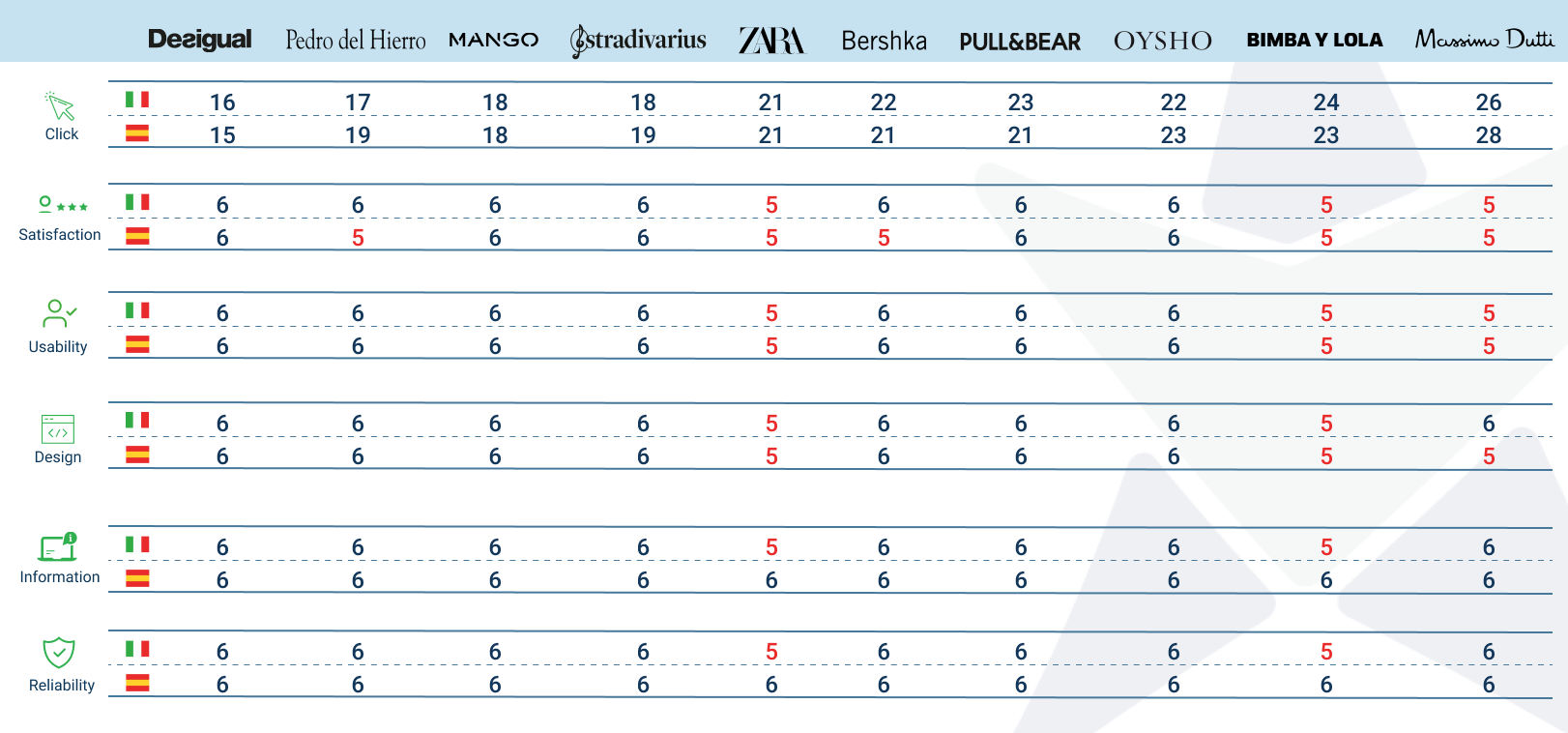
(Research conducted in 2021 by AppQuality, named UNGUESS after Jan 2022)
Italian eCommerce 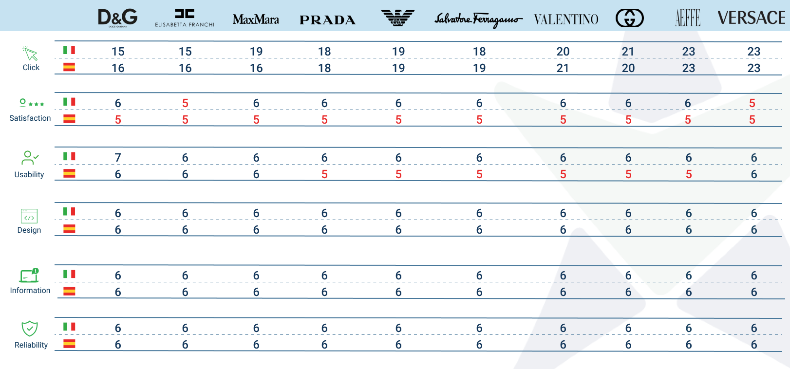
(Research conducted in 2021 by AppQuality, named UNGUESS after Jan 2022)
Notes: in both tables:
-
-
the first line refers to the opinions given by Italian users, the second by Spanish users;
-
valuations are rounded up;
-
the brands follow on from each other in order of necessary clicks (from fewest clicks to most clicks);
-
the scale, as mentioned, goes from 1 to 7. Results below 6 (therefore from 1 to 5) are marked in red.
On average, the clicks needed to complete the purchase on the eCommerce sites of Italian luxury companies amount to 18.8, slightly less than the 20.8 required for Spanish retailers. There is also not much difference between the Italian and Spanish companies in terms of the five metrics of satisfaction, usability, design, informativeness and reliability. Satisfaction recorded a negligible difference between the two clusters, which were positioned around 5.4. The same is also true of usability and informativeness, which obtained 5.7 and 5.8 respectively in both cases. Reliability was the highest-scoring metric for retailers and luxury, which averaged 5.9 and 6, respectively. The strongest deviation was two tenths in design, where the Italian brands scored 5.9, slightly higher than the 5.7 of the Spanish ones.
Let's move on to the last two metrics: the Customer Effort Score (CES) and the Net Promoter Score (NPS).
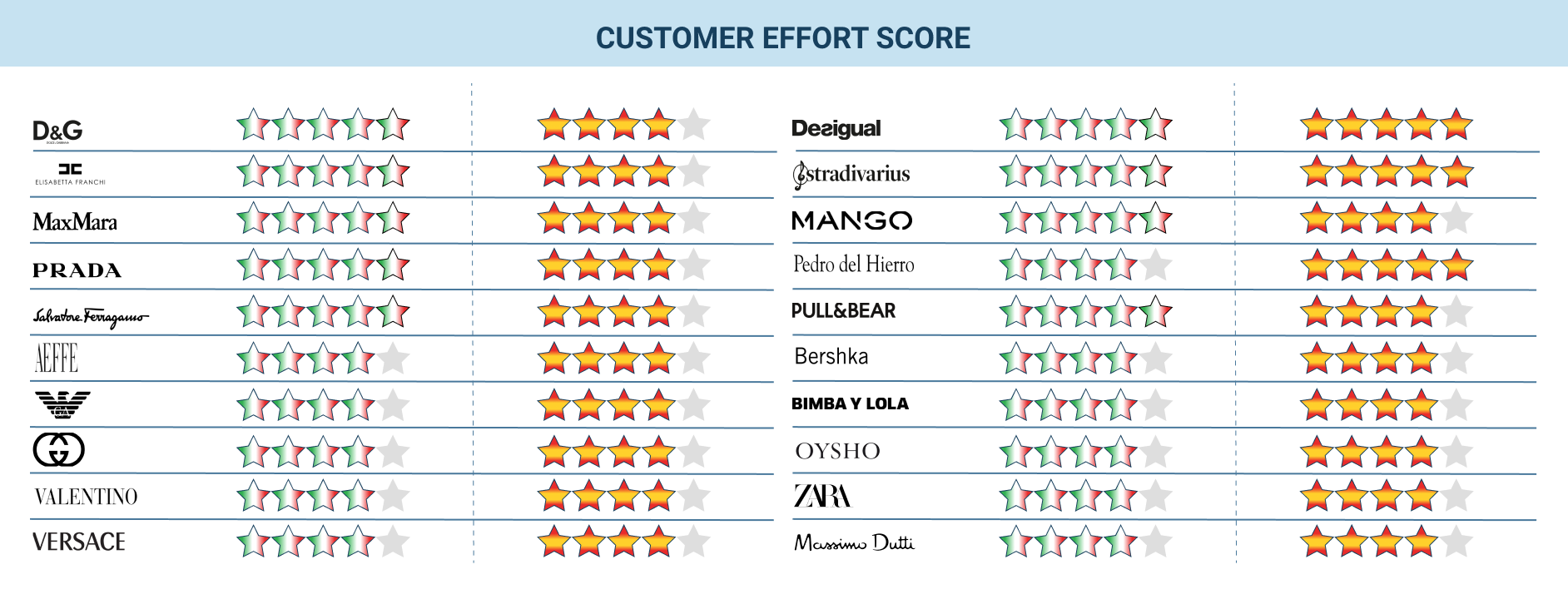
The results of the Click Challenge:
Effort and Recommendability
As mentioned above, both parameters were evaluated with a scale from 0 to 5, where 0 is the most negative value. More stars mean that the process was perceived as simple (low Customer Effort) and the user would recommend it (Net Promoter Score),
Customer Effort Score (CES)
To calculate the CES, users were asked "How easy was it to complete the task?"
(Research conducted in 2021 by AppQuality, named UNGUESS after Jan 2022)
Note: the first half of the table shows the ratings given to Italian brands by Italian users (stars with the Italian flag) and by Spanish users (red and yellow stars).
In the second half, however, we find the ratings given to Spanish eCommerce sites by Italian and Spanish users.
Again, no contrasting values emerged between retailers and luxury. All the brands, except Massimo Dutti (rated 3.8), received a minimum score of at least 4 out of 5. This means that on average the user did not find it difficult to complete the purchase on the eCommerce site.
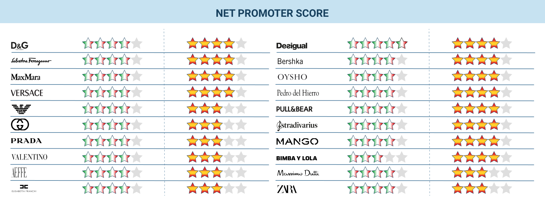
Net Promoter Score
To calculate the NPS, users were asked "How much would you recommend this site?"
(Research conducted in 2021 by AppQuality, named UNGUESS after Jan 2022)
Note: This table follows the same structure as the previous one.
This was also rated on a scale of 0 to 5. The lowest score was given to Italian luxury companies by Spanish users (3.4 out of 5). By contrast, Italian luxury brands were a big success among Italian users, who rated them 4.1 on average, with peaks of 4.4 for Ferragamo and Dolce & Gabbana. Spanish users also assigned the lowest NPS. In fact, Alberta Ferretti, Elisabetta Franchi and Prada scored 3.1 out of 5. The highest NPS of all was given to Desigual by Italian users (4.5).
The personal shopper evaluation
The personal shopper is a virtual salesperson who advises the customer on their choice of products. It is clear that this kind of virtual figure has become extremely useful with the onset of the pandemic and the consequent increase in online shopping. We are not talking about a chatbot that helps to find a product on the website or gives information, but about a fully fledged consultation. As if the customer were in the shop and asked for help from a salesperson.
We asked Italian and Spanish users to evaluate the usefulness of the personal shopper and how easy the eCommerce user experience is. For this analysis, we evaluated the chats available on the websites. Some eCommerce sites provide additional services however, such as booking video calls with a salesperson.
Not all the eCommerce sites analysed have a personal shopper available. The Italian companies Elisabetta Franchi, Giorgio Armani and Versace and the Spanish Bimba y Lola and Pedro del Hierro DO NOT supply one.
Personal shopper: how useful is it perceived?
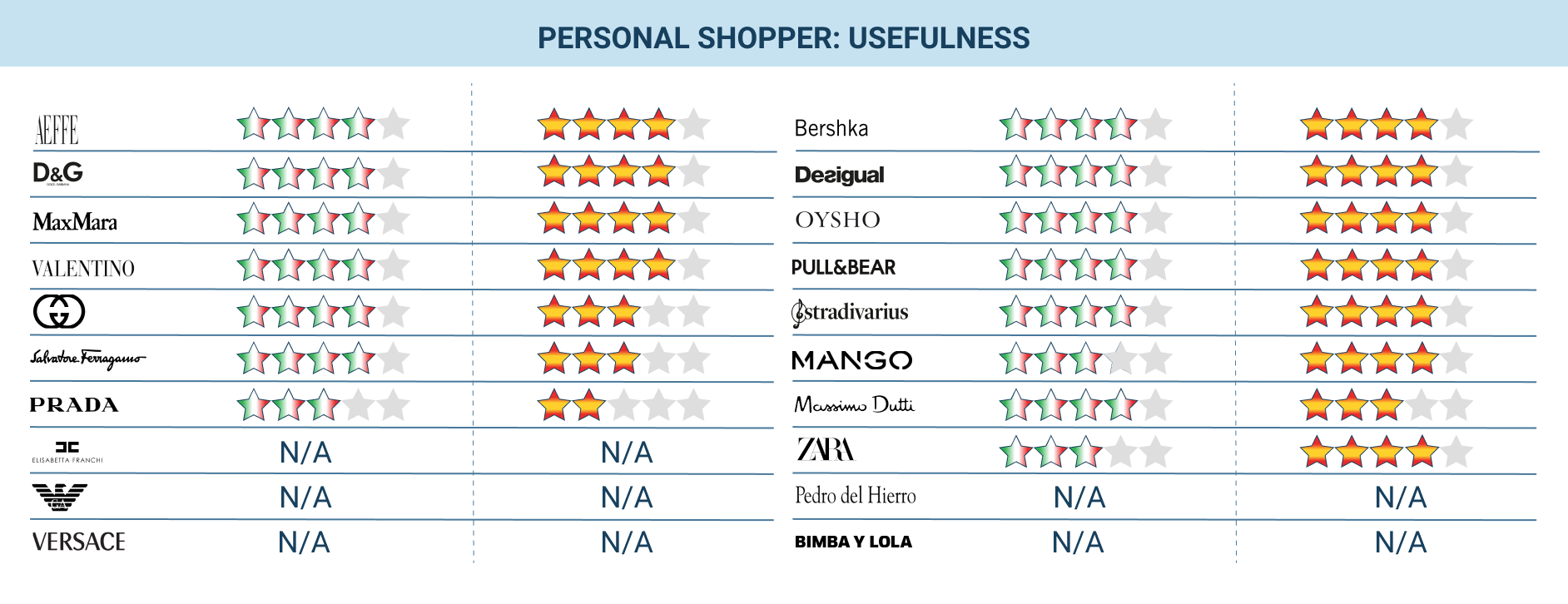
(Research conducted in 2021 by AppQuality, named UNGUESS after Jan 2022)
Italians rated the personal shopper for Italian luxury brands as more useful (3.8 vs 3.5 given to retailers). Exactly the opposite happened for the Spaniards, who rated the shopper more useful for Spanish retailers (3.8 vs 3.4 given to Italian brands).
Out of the Italian brands, the personal shoppers evaluated as most useful were those of Alberta Ferretti and D&G (4/5), while among the Spanish ones it was Desigual (3.8/5).
Note: In both tables (this one and the next), the wording N/A means that the testers could not find the personal shopper or that the service was not available at that time.
To what extent did they facilitate the experience?
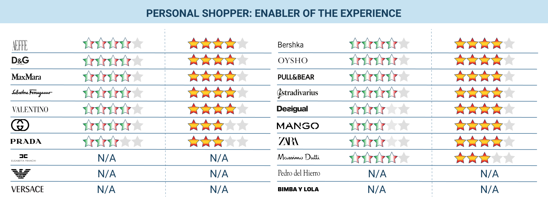
(Research conducted in 2021 by AppQuality, named UNGUESS after Jan 2022)
Here, too, the results of the previous table are repeated. The Italians found personal shoppers on Italian luxury goods more helpful (3.7 vs 3.4 given to retailers), while the Spanish preferred the experience with Spanish retailers (3.8 vs 3.5).
The chatbot was therefore positively evaluated by both Spanish and Italian users. In particular, the possibility of referring to a real person and, in some cases, of conversing on Whatsapp was appreciated ("I think the idea of being able to interact with assistants via whatsapp is nice", "The live chat was not active but it was possible to send a message with WhatsApp").
However, areas for improvement emerged from the testers' comments:
- The recognition process for the personal shopper before being able to get in touch with them can be simplified ("the assistant… took a while. I had to send him various kinds of info and that's annoying"). The analysis, the planning and the proper laying out of the processes are in fact the most challenging steps in a project of this type.
- Response times are long in some cases. ("It takes a while to get answers from the live chat with the personal shopper"; "the chat did not answer the question I asked him in a reasonable time and so I closed the website"). This highlights how important it is to adopt technologically advanced and structurally sound solutions.
- Often the bot can only answer basic questions, while for the rest you have to wait for a virtual assistant to come. Improving the bot's performance would reduce the need for individual assistance ("the chatbot can't answer simple questions and goes straight to an operator", "the bot didn't understand what I wrote. After that, a virtual assistant was able to answer my request").
- Sometimes it is difficult to switch from the bot to a real person. Also in this case it is clear how important it is to rely on a solid solution that is not only based on the "best text recognition engine" but also implements advanced user experience logics, such as the transition from bot to operator. The analysis and design of well-defined processes become essential for a good user experience.
- Users often found themselves shopping at times when chatting with the personal shopper was not available ("Too bad there is a limited time 10:00/17: 00 to get assistance"; "Chat unfortunately has a huge limitation, it's only active until 17"). In one case it was also available after hours, but only in English.
If we were to simplify the message: the personal shopper is appreciated by users, and it can substantially help to improve eCommerce conversions but it must be designed carefully, thinking about the entire end2end funnel of the user, and use suitable technologies. There is still a lot to be said about personal shoppers and their progress. Some websites, as mentioned at the beginning of the paragraph, have made additional services available such as video calls with shop assistants.
As already noted, to offer a more complete overview of the functionalities of the personal shoppers on Italian and Spanish eCommerce sites, we turned to Vivocha. The document with the complete analysis is available at this link.
Conclusion
As we have seen in this Click Challenge, in the experiential process of buying on a fashion eCommerce site, especially in the world of luxury, a high number of clicks does not affect the shopping experience on the site, just as a low number of clicks does not translate into a happy customer.
In particular, for fashion eCommerce site, a comparison that we often cite in our Click Challenges applies:
We think of the number of clicks like the kilometers of a road. Across the same length, I may have different travel times (objective measures) depending on the surface (tarmac, cobblestones) and the route (motorway, mountain). In the same way, I will be able to have positive or negative experiences (subjective measures) regardless of the time taken: a nice route through the hills, even if it's longer, will be more rewarding for those who appreciate the landscape. The experience, both in objective and subjective terms, can then also vary depending on the car I will be driving (e.g. off-road, sports): there are design patterns that work with some users and not with others (e.g. the elderly).
The speed of online procedures is imperative, but, just as in residential areas we have the bumps to slow us down, in delicate processes such as those of buying a dress there are times when it is good to create friction, to make sure that the user has understood, that the user has appreciated a particular detail or has entered accurate information (for example for shipping), and then let it restart at full speed. That said, as a first step for choosing our route, each of us looks at the kilometres and then considers the rest, so it seems to me to be a good starting point.
Another note that we must make at the end of each Click Challenge is that the study can in no way replace a usability or UX test. The results are used by the analysed companies and other companies in the sector to get an idea of their positioning with respect to their competitors, to recognise weaknesses and to further investigate their specific case as a result.
When a metric tells us if there is probably something to fix, we need to analyse the experience by going in depth. It is necessary to thoroughly observe the users (for example with the Unmoderated User Testing method or by analysing the User Journey) and, starting from the observation of their behaviours, understand the particular cases for each brand, finding out what the best times for having an online personal shopper are, for example, or how to decrease the effort involved in making a purchase.
As always, UNGUESS is available to all those brands who want to optimise their customer experience by building fluid products designed for users and customers. To do this, we unleash the power of the Collective Wisdom to help companies make smarter and faster decisions.
