The Challenge
A large number of Italians are booking their holidays and purchasing flights online: according to ISTAT data, 66.5% of bookings were made online in 2021 (58.4% in 2019)[1]. Booking.com, eDreams, Expedia, Kayak, lastminute.com, Skyscanner, Tripadvisor and Volagratis are among the best-known flight comparison and booking sites in Italy (and beyond), which is why we asked our community to try them out[2], with the aim of identifying the most popular site among users and, most importantly, the features that make it the best. The results of the analysis reveal, for example, that it takes less than two minutes and 12 clicks to book a flight online.

The People
For this study, we involved Italians who have already booked a flight online, albeit with varying frequency (from less than once a year to at least once a month). These are users who generally book flights themselves, without contacting travel agencies, and do so via both mobile and desktop. Finding this sample of users was easy: we selected the ideal people for this role from within our worldwide community.
The elements the community was asked to test included the following, rated on a scale of 1 to 7: how easy it is to book a flight online on a particular site (expectation versus reality), how many clicks it takes, how user-friendly the site’s features and graphics are, and whether they would recommend the service to a friend.
The Method
Benchmark Competitor Testing
The method had been chosen to use metrics to gauge performance against meaningful standard and identify which applications or digital sites, within the same competitive arena, are preferred by testers. Testers were then asked to rate products before, during and after use to compare this data.
Competitive Usability Test, Unmoderated & Thinking Aloud
Users were assigned the same - representative - task to perform on each competitor’s site. This methodology allowed us to compare the effectiveness and efficiency of different designs. Unmoderated remote testing does not require the researcher presence during the test session. Instead, we gave instructions to the users and recorded their actions while performing the task.
Additionally, with a thinking aloud test, we asked test participants to use the system while continuously thinking aloud — that is, simply verbalizing their thoughts as they moved through the user interface.
Expectations: a task that is easy to complete and tends to be quick
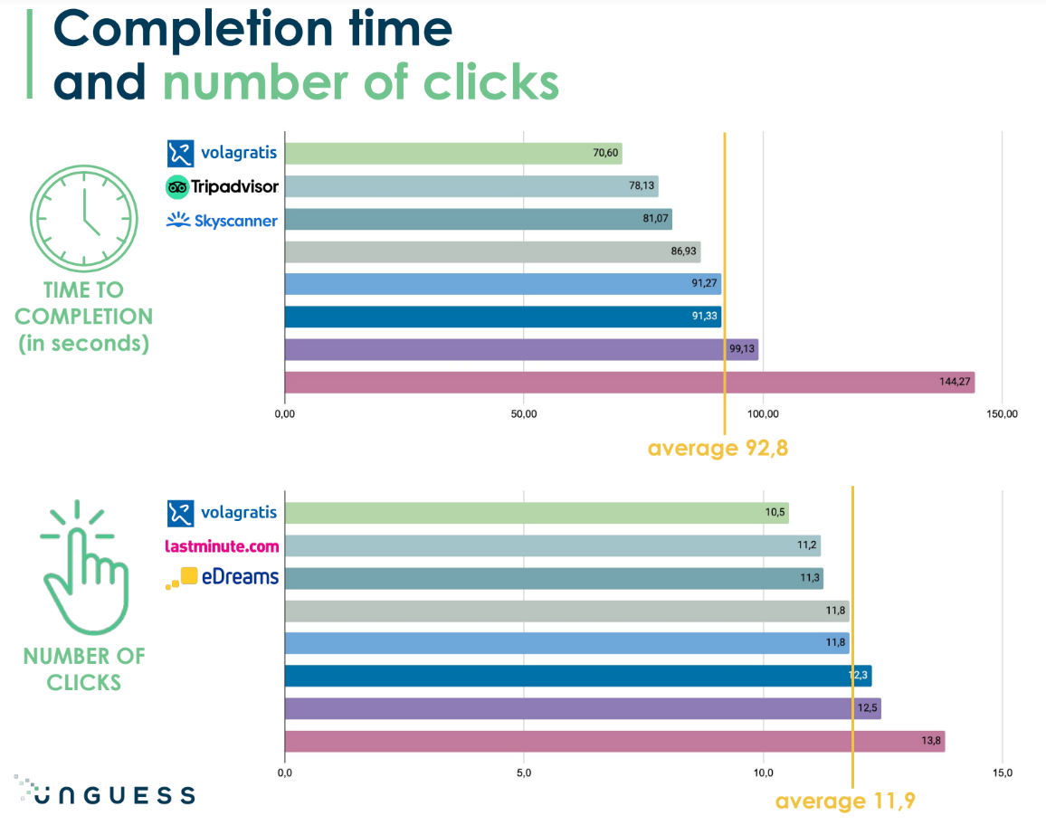
The task completion time on the eight flight comparison sites was quite varied, with a minimum of 70.6 seconds and a maximum of 144.27 seconds (almost two and a half minutes). Yet the time users expected to take before starting the task was higher, with 60% of participants believing it would take between two and five minutes (against a real average of one and a half minutes).
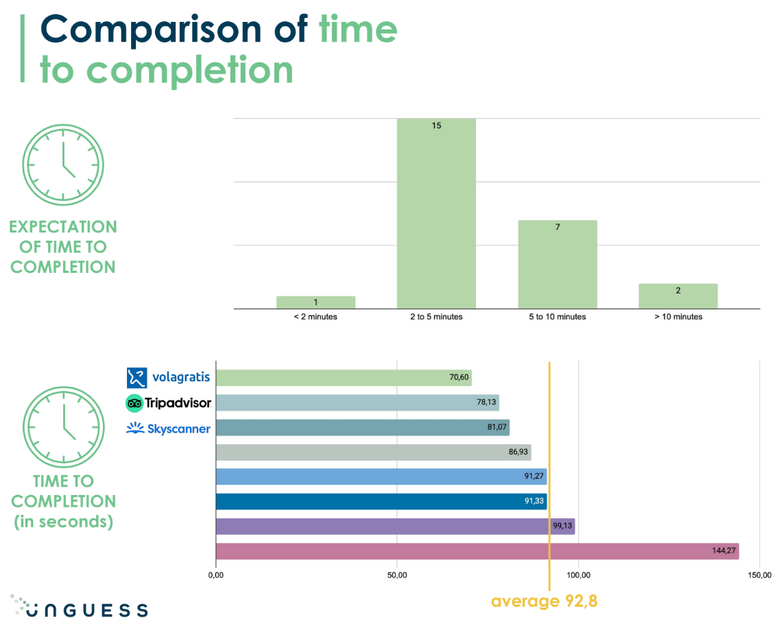
“While the task completion time varied from one website to another, it turned out to be much shorter than expected before the test,” comments Laura Morabito, UX Designer & Researcher at UNGUESS. “This may show that, since the user has much longer expectations of the task flow duration, the quality of the interaction determines the ‘perceived’ speed.”
Expectations regarding ease of completion were rated at 5.88 out of 7 overall, demonstrating that users are now accustomed to buying flights online, and even those who have never done so still consider it an easy task. Once the task had been completed, the actual ease of booking a flight was rated at 6.13. Specifically, eDreams, Booking.com and Tripadvisor are rated the “most user-friendly” comparison sites.
“The perceived ease of use during the test is also better than expected, although we had anticipated even better results given the significant gap between the expected duration and actual time spent,” comments Laura Morabito.
In terms of the number of clicks taken to complete the task, the average was 11.9 clicks[3], and again, the Volagratis site ranked first with just 10.5 clicks, followed by lastminute.com with 11.2 clicks and eDreams with 11.3 clicks.
“Although clearly the number of clicks gives a sense of the platform’s user-friendliness, users then choose a comparison site from the available alternatives mainly on the basis of other parameters, such as how prices, timetables and baggage information are presented, as well as loyalty programmes and non-seat ancillaries. The number of clicks with all the necessary steps to buy a flight online is only in third place,” explains the UX Designer & Researcher.
Satisfaction, information quality, attractiveness and promoter score: a (almost) unanimous top three
The satisfaction, information quality, attractiveness and net promoter score (i.e. “likelihood to recommend” to a friend) metrics received positive ratings, with an average of 5.65, 5.86, 5.8 and 5.58 out of 7, respectively. The top three remains unchanged in terms of the satisfaction, information quality and net promoter score parameters, with eDreams, Booking.com and Tripadvisor as the top players.
One variation can be seen in terms of attractiveness, where together with Booking.com and eDreams we find Skyscanner (so eliminating Tripadvisor).
“From these data, it can be seen that the metrics are highly consistent: a product that is perceived as more satisfying also has better information quality for users, is attractive and would be recommended to friends,” explains Alessandro Caliandro, Product & Design Lead at UNGUESS.
What have we learned from the Thinking Aloud Test?
- Anticipate user needs: How usual is it for the user to select a direct flight? When to provide info about the included luggage?
- Give it an extra edge: When all the search forms are similar, focus on micro-interactions and for a memorable experience
- Relieve the waiting: If you can’t reduce the waiting, make an effort to work on your visuals and UI elements to make evident and enjoyable the loading time
- Give users control: Display precise and reliable information: don’t present the premium offer as the default option
- Repeat yourself: Users continuously check the price amount, going back and forth between steps; display price and schedule information in each step in the same position
- Stay on the bright side: Users are more likely to buy from you if they trust you and they are often digitally literate enough to recognize a commercial ad from a legit option
Three factors that determine success
As we have seen, user ratings were generally positive, but what determines the success of a flight comparison site?
- Parameters: how are prices, timetables and baggage information presented?
- Loyalty programmes and non-seat ancillaries: do these affect information clarity?
- Number of interferences: how many steps, pages and pop-ups are shown to the user before allowing them to complete the process?
[1] https://www.istat.it/it/files//2022/04/Viaggi_vacanze_2021.pdf
[2] Twenty-five people with an average age of 35 (15 men and 10 women) participated in this new UNGUESS test, 19 of whom
performed the test via desktop and the remaining 6 via mobile.
[3] The number of clicks is expressed as an average of the results of the various test participants. This is why, in some cases, clicks
have decimal places.